There's a beauty to crafting an effective resume.
As an experienced Visual Merchandiser, TopResume's makeover contest winner, Mona, has an eye for beautiful things. Unfortunately, this talent was not translating to her resume during her most recent job search. While she had tried to update her resume on her own, a frustrated Mona had been actively searching on and off for the past year with little success. That's when she decided to sign up for our makeover contest. She worked with our professional resume writer, Laura, to create a document that would highlight her experience and visual expertise and position her for success. We sat down with Laura to hear a bit more about the top five changes she made to Mona's resume. Here's what she had to say.


Visually appeal to the hiring manager
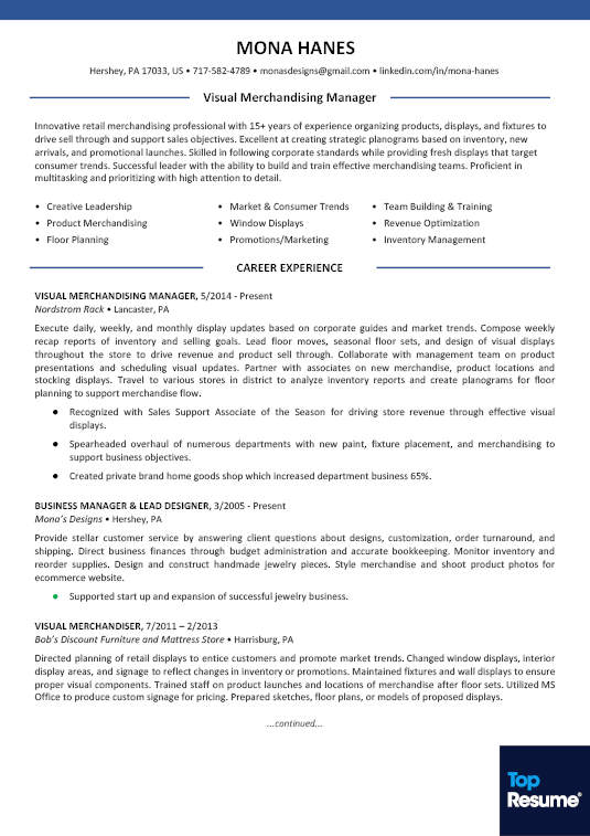
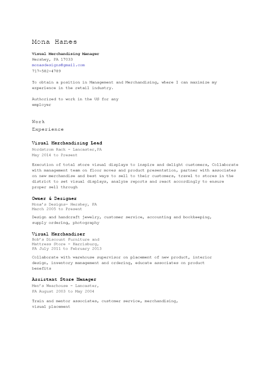
Laura: Mona's original resume was very bland. I utilized a modern format because she is in a visual and creative industry — this will help her resume stand out for the right reasons. It's all about creating a visually appealing resume that's also polished and clean. You do this by balancing visual elements like color and bullet points with content and white space.
Put skills front and center
Laura: I wanted to highlight Mona's key skills in a way that would be easy for hiring managers to find. I added a Core Competencies table under her professional summary to give a quick rundown of the top skills she has to offer. Her original resume didn't have this feature, which made it difficult to find her key areas of expertise.
Show off achievements
Laura: I pulled out Mona's unique accomplishments from her job-duties summaries and formatted them with bullet points. This draws attention to Mona's achievements during a first look over of her resume. Hiring managers like to see accomplishments, and this was a simple way to show off Mona's qualifications and how she goes above and beyond in her work.
Avoid ageism
Laura: I downplayed Mona's many roles by creating a Career Note section for jobs before 2005. It's best to show only the job history from the last 15 years to both keep the resume relevant and mitigate any potential age discrimination. With this strategy, I was still able to showcase her titles and employers without revealing dates.
Focus on the future
Laura: I also downplayed Mona's self-employment by changing her “Owner” title to “Business Manager & Lead Designer.” Some employers see self-employment as a red flag and question if the individual can be a team player. By using a functional job title, we shifted focus from owning a business to the work she did that highlights her qualifications for what she wants to do.
With all of these combined changes, Laura was able to create a new resume for Mona that will successfully pass through the ATS while also appealing to the human readers on the other side.
Not showcasing your best self on your resume? Need a little extra help? That's where our TopResume writers come in.
 Jenna Mantis